There are a wide variety of diagrams you can choose from, depending on what you hope to describe.
Types of diagrams: An overview
If you are looking to show how different categories compare to one another (and aren’t doing so in a numeric way with a bar chart), you might consider using a:
- mind map,
- matrix, or
- Venn diagram
If you want to communicate about how different parts of a whole are connected, you might choose a:
- circle diagram,
- tree diagram, or
- pyramid diagram
If you want to visualize how events or tasks are sequenced in a process, you could select a:
- funnel chart,
- journey map,
- Gantt chart,
- flowchart,
- fishbone diagram
Here’s a quick summary of the types of diagrams that you can use and how you can use each of them.
How to choose the right diagram
When thinking about which diagram is right for you, always start by first considering what is important to your audience. This is important because you want others to easily connect with the information you want to share and for them to be able to easily grasp key ideas.
When you know what’s important to your audience, and thus what you want to share, then you can choose what type of visual might be most useful. This decision can be based on the information you are working with and/or the important ideas you want to convey.
Let’s take a closer look at each diagram type and its use cases.
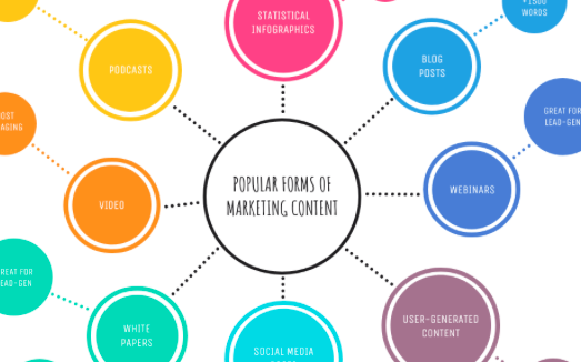
Mind map
You are probably already familiar with mind maps. Usually there is one central idea with various branches to supporting ideas, known as nodes.
You can use a mind map to visualize information such as:
- A main topic with nodes describing subtopics or themes
- A main question with nodes describing avenues of exploration
- A project with nodes describing different components or teams
- A network of people with nodes describing the people and branches describing relationships (this is known as a network map)
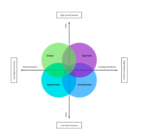
Matrix or quadrant chart
This type of diagram displays information along two axes, but that doesn’t mean the information needs to be quantifiable. You can use two descriptions, one for each axis, to essentially break a list into four categories.
This chart is ideal to use if you want to not only categorize but also rank items, as those that appear higher on the axes (in the upper right quadrant) will connote more significance.
You can use a quadrant, for example, to describe:
- Internal and external factors in business strategy—SWOT and PEST are two common examples
- Project priorities based on potential effort/cost and impact/value
- Work plans based on what’s urgent and what’s important (this is known as the Eisenhower Decision Matrix)
- Competitive landscapes—for example, the Gartner Magic Quadrant compares companies’ completeness of vision and ability to execute.
Venn diagram
Venn diagrams look like two or more overlapping circles, with text in each section of each circle that describes the categories. With these diagrams, you can quickly communicate differences and similarities between items when there is no inherent rank to them.
Although they were invented for mathematical logic, they are incredibly flexible for conveying any kind of relationship. You can use them to compare characteristics of products, services, companies, markets or other patterns.

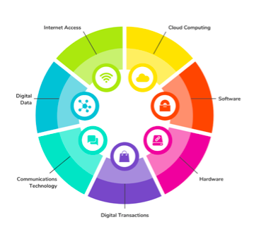
Circle diagram
A circle diagram is a great way to present topics as parts contained within a whole. There are two primary ways to do this.
The first is to use concentric circles, each of which is inside another. This could be useful for visualizing hierarchy or order of some kind, for example people in a neighborhood, in a city, in a state, in a nation, etc.
You can also arrange themes around the edge of a circle. This can be an effective way to visualize parts in a way that emphasizes them equally. For example, you could describe aspects of a topic or system.
Tree diagram or dendrogram
Like mind maps, tree diagrams are composed of nodes and branches, but what makes them different is that the nodes are ranked or hierarchical. By arranging information this way, your audience will be able to better see and understand categories within categories.
Tree diagrams, also known as dendrograms, are often presented with a parent node at the top and child nodes beneath or a parent node to the left and child nodes to the right. They can be simple or complex, depending on the information.
You can use a tree diagram to visualize topics like:
- Company roles and reports — known as an organizational chart
- Family and/or genetic relationships — known as a genogram
- Evolutionary relationships — known as a phylogenetic tree
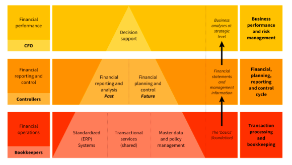
Pyramid or triangle chart
A pyramid or triangle chart also shows parts of a whole in a ranked or hierarchical way, but is much simpler than a tree diagram. This chart is best to use when you want to emphasize a natural order, usually of size or importance, to the topics.
These charts are often used to communicate that there are building blocks of some kind. Two common examples are food pyramids and Maslov’s hierarchy of needs.
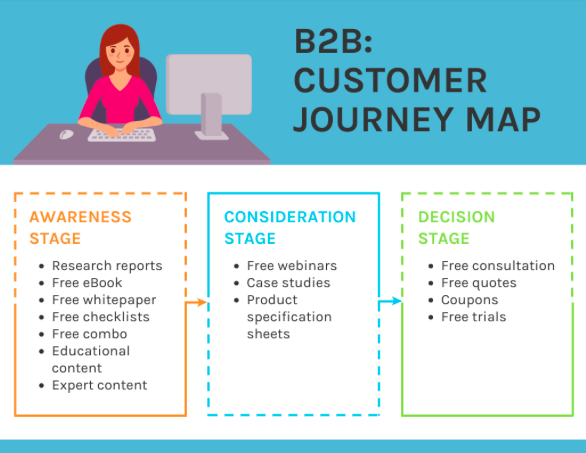
Funnel chart and journey map
Sometimes, you’ll need to describe discrete stages of a plan or process, at a high level. For example, you might outline a strategy that will unfold over time, or tell a story about events that take place in a before and after fashion.
One option is to use a funnel chart. A funnel chart is a very simple visual that describes discrete stages that progress toward a specific outcome. Note that a funnel chart looks like an inverted triangle chart, but it is often used to describe a process of some kind so is best to use for that purpose.
Funnel charts are good for facilitating a very basic understanding of stages. They are often used in a marketing and/or sales context to show how a large market becomes a smaller group of leads and ultimately a set of customers.
If you are wanting to include more detail, then a journey map is a great option. A journey map also shows stages, usually also toward specific outcomes, and it can include varying levels of detail to describe the stages as well as the experiences people have at each stage.
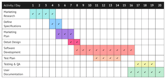
Roadmap and Gantt chart
While funnel charts and journey maps outline stages, they are usually pretty conceptual. If you are looking to use a diagram to plan a project, you will likely want to use a diagram that is more practical and allows for more specificity.
Roadmaps are similar to journey maps in that they outline stages, but usually they are used for internal planning so they include things like benchmarks and time frames.
Gantt charts are even more specific, and they often shift the focus to the teams and/or individuals who are responsible for executing the plans. They can be very detailed, drilling down on dependencies, deadlines and dates.
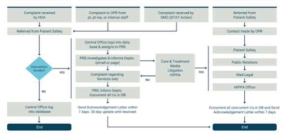
Flowchart, feedback loop and decision tree
A flowchart is a diagram that visualizes a process or workflow, often one that has multiple turning points or paths. Typically, you use boxes or shapes to represent different steps in a process, and then you connect those steps with lines or arrows.
Because flowcharts are incredibly flexible and widely understood, they’re the gold standard when it comes to communicating processes with multiple paths. They can be easily customized to fit the level of detail you need for any process, such as the people responsible for a given subset of tasks, or the time a set of tasks might take.
Flowcharts can get pretty complicated, so here are some tips for making sure they are still clear and useful:
- Limit the number of points, flows, and text to make it easier to read
- Use arrows to guide those reading the chart
- Use color and/or icons to differentiate between paths and/or emphasize important decision points
- If there are parallel stages or decisions, position them to level with one another
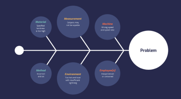
Fishbone diagram
As you can see, there are many ways to use a diagram to communicate about changes over time. If you want to focus on identifying causes and effects, a fishbone diagram is for you.
A fishbone diagram (also known as an Ishikawa diagram) looks like, you guessed it, a fish skeleton. Lines that extend from a main one in the middle describe different factors that lead to a specific outcome. They are usually used for root cause analysis.
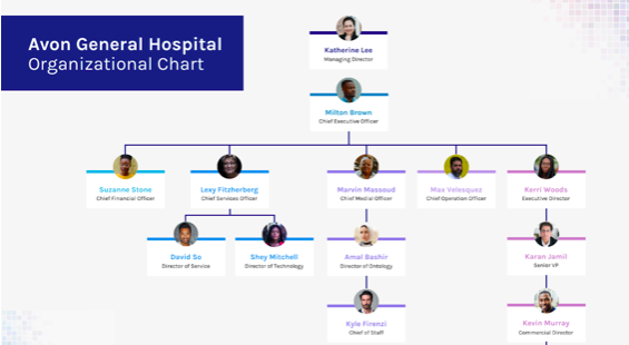
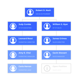
Hierarchy or organizational chart
Briefly mentioned before, an organizational chart is a diagram that represents the hierarchical structure of a company. It shows how teams and departments are organized, the reporting relationships across the organization, and every individual’s role and responsibilities.
There are four main organizational chart types: vertical, horizontal, matrix and creative. Venngage has organizational chart templates for conventional and non-conventional structures too.
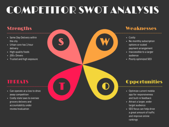
SWOT analysis diagram
You use SWOT analysis diagrams to evaluate your organization’s internal strengths and weaknesses, along with external opportunities and threats to your organization’s performance. After conducting a SWOT analysis, you have a better picture of how you compare to the competition, and how to differentiate yourself.
SWOT diagrams tend to follow a very simple structure, like this SWOT diagram templates:
Quick diagram design tips
Here are some quick tips to help you design diagrams that are effective and compelling.
- Organize the information logically
Bear in mind that people read left to right and top to bottom, so your organization should either flow in this fashion or be arranged in a circle/radially. Pay attention to how you arrange ideas, as this is what makes diagrams meaningful in the first place!
- Keep it consistent.
This applies to the shapes, lines, icons, and colors you use. Consistency makes visuals easier to read and it makes them look so much better too!
Here are some examples of diagram templates where the colors coordinate with each other to make the information easy to grasp:
- Use color to add meaning
You can use different colors to contrast different themes, stages, or teams, for example. Good use of color should help a reader get the big idea at a glance before they drill down into reading all the text.
- Label well
Use larger text to label categories, parts, flows, etc. In general, it’s better to include labels within the visual, rather than using an adjacent legend. Be sure to use words or short phrases your audience will understand and avoid clunky jargon.
- Minimize clutter as much as possible
Consider removing what’s obvious or unnecessary, and make sure you don’t have visual elements (text, shapes, lines, etc.) that are overlapping one another. Try to limit the amount of text you include.
If you find this to be challenging, you may need to make your diagram or graphic larger, reformat it to read vertically instead of horizontally, or even split it apart into separate visuals.
- Ask others for feedback
When your diagram is ready for sharing, don’t forget to ask others what they think so you can improve your visual communication skills over time.
In summary: Choose the right types of diagrams to best communicate your data for your audience.
Source: Lydia Hooper.